Well-Being Support Tab
Well-Being Support Tab - U of T
How can we provide students of University of Toronto with easy and quick access to the most valuable and appropriate well-being information?
How can we provide students with easy and quick access to the most valuable and appropriate well-being inforamtion?
This is a project I did at University of Toronto's UX team and the tab is currently live on the Students Information System (ACORN).
How can we provide students of University of Toronto with easy and quick access to the most valuable and appropriate well-being information?
DATE
May - Jul 2019
MY ROLE
User Researcher and UX Designer
METHODS& TOOL
Survey, User Interview, Card Sorting, Usability Testing,
Figma, Invision
DATE
May - Jul 2019
MY ROLE
User Researcher and UX Designer
METHODS& TOOL
Survey, User Interview, Card Sorting, Usability Testing,
Figma, Invision
SUMMARY
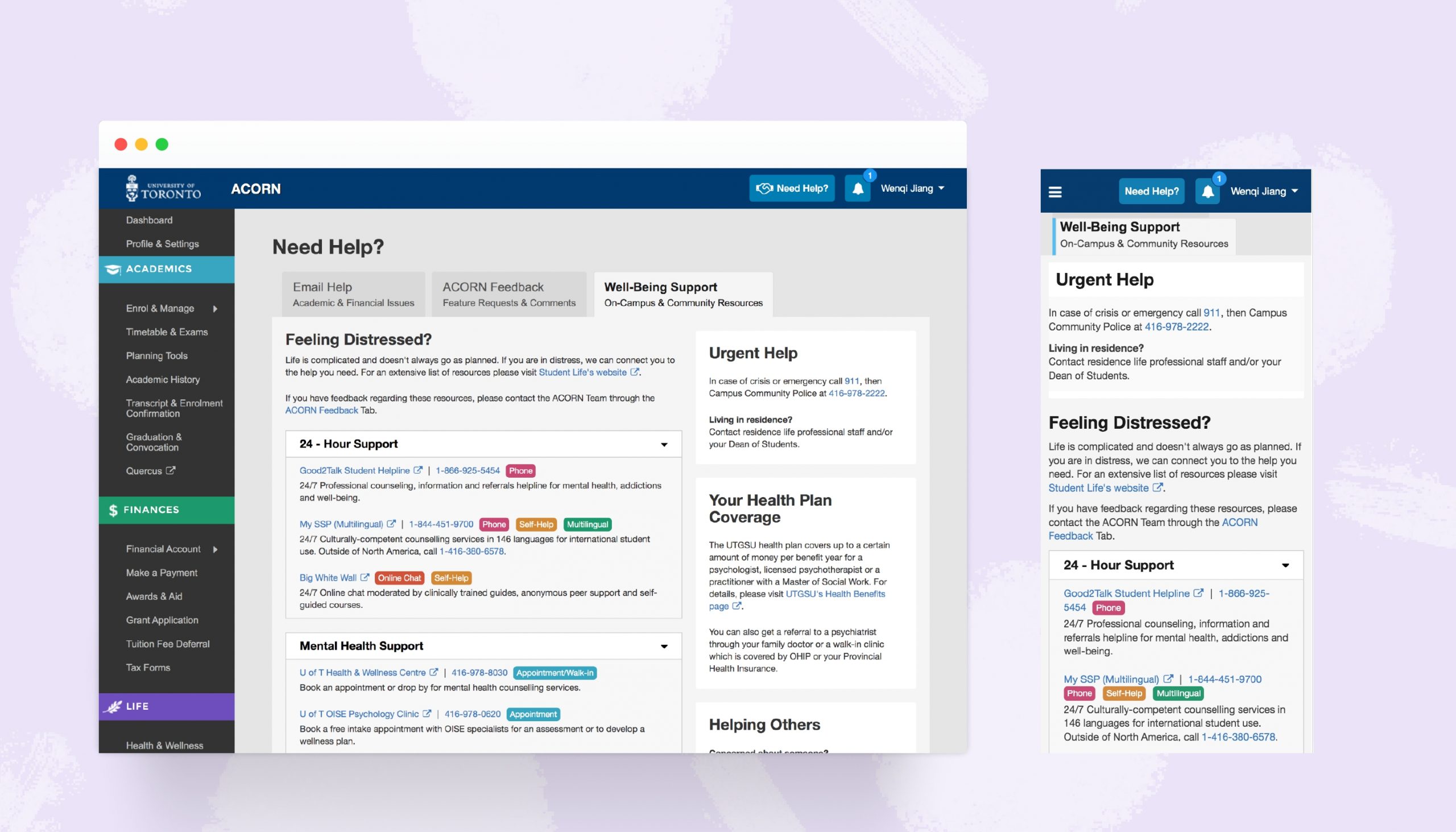
Creating a tab on the University of Toronto's student web services (ACORN) to provide students with easy and quick access to the most valuable and appropriate well-being related information.
This is a project under U of T's Enterprise Applications and Solutions Integration (EASI) team and the tab is currently live on ACORN.
SUMMARY
Creating a tab on the University of Toronto's student web services (ACORN) to provide students with easy and quick access to the most valuable and appropriate well-being related information.
This is a project that I did when doing summer co-op at U of T's Enterprise Applications and Solutions Integration (EASI) team and the tab is currently live on ACORN.
The Problem
U of T’s mental health services, despite being available, are not actually accessible.
Students don’t know where to look for mental health and wellness information. The existing information page from different U of T websites is overwhelming. Students don’t know what exactly the issue is.
“There wasn’t much information about this and I wasn’t sure where to start”
"What exactly are my options with mental health services?
What type of things/services am I covered for?”
Project Goals
Research and select the most helpful resources both on-campus and off-campus to help support student's well-being
Present personalized resources in a way so that students can easily find the right one they are looking for
The Process

| Preliminary Research
I conducted researches online through Reddit, Facebook and Twitter to learn about students' real feedbacks on the university's performance of well-being support. I also evaluated existing websites from the University of Toronto that have well-being/mental health resources.
- Online Research
1. Overwhelming Information
There are 5+ websites listing long and duplicated resources. All organized in different ways

2. Missing Clear Coverage Information
Students care about the cost of getting treatment but the coverage was not explained anywhere on the mental health resource pages

3. Too many resources but little guidance
There are multiple options under different categories with basic descriptions providing little guidance for students to select the most appropriate resource

- Interviews & Card Sorting Activities

A consolidated list of resources was made based on the existing resources from U of T's student life, health & wellness centre, as well as validated suggestions from students through social network platforms.

8 card sorting activities were conducted to find out the best way to categorize and present the resources to students.
Each card sorting activity was followed by a post-activity interview so participants can share feedback.
| Synthesis & Analysis
Key Insights


Design Decisions


| Prototyping & Usability Testing
- Initial Prototypes
Design 1. Prioritize emergent help. Use on-campus and community as the first level of categorization. Present a relatively short list to students.

Design 2. An accordion option that has everything collapsed except for the first one. Urgent help is always visible through the top right card.
Emphasizes the coverage information right below the urgent help card.
Resources are categorized by the type of help. Each category has On-Campus resources showing first and followed by Off-Campus resources

Design 3. A more detailed list with filters. Students can filter by type of support and the location.
Emergent help is prioritized. The following sections are categorized by type of distress.

|Feedbacks & Iterations
Based on the feedback from design critiques with the UX team and the feasibility checks with the development team. Usability testings were then conducted with participants from U of T.
Type of support such as through Phone or Appointment is represented by short tags. A personalized list with minimal in-page interaction was selected among iterations.


Final Tab View in ACORN: desktop & mobile